
15 Mar HOW COLOR EFFECTS US
HOW COLOR EFFECTS US
How the colors you choose for marketing influence people’s thoughts, feelings, & decisions.
There are multiple things you need to think about when choosing colors for marketing materials. Some are related to branding, readability, or color contrast. Color psychology looks at how we are impacted by colors, mentally & emotionally. Marketers use it intentionally to influence people’s feelings, thoughts, & actions.
“Color is a powerful communication tool and can be used to signal action, influence mood, and even influence physiological reactions.”
– “Color Psychology: How Colors Impact Moods, Feelings, and Behaviors”, VeryWellMind.com
It’s not an exact science. But experts agree that there is strong evidence that color impacts people’s actions & decisions. Do a little color research to learn how color is effecting your audience.
THE MEANING OF COLOR
The meaning a color holds for us is based on personal, societal, & cultural influences. A good example is in the variety of colors used for mourning across the world.
- In Western culture, funeral ceremonies dress in reverent black.
- In Chinese culture, family members dress in white, representing sterility, mourning, unhappiness and misfortune.
- For South American countries, such as Brazil, purple is the color for mourning and death.
- And in Latin culture, yellow is the color people wear to show respect for the dead.
(Source:“Color & Cultural Design Considerations,” WebDesignerDepot.com)
“Our judgments about color aren’t just about personal preference; they’re also about your associations, your aesthetic ideas, and your cultural values.”
– “Why Are We So Obsessed With Millennial Pink?”, Bustle.com
What does this imply when choosing colors for marketing? Consider where it will be seen, & who you want it to impact. Make a list of the demographics you speak to & what cultures make up your audience. This can help give you a better understanding not only of how your audience might be influenced by color, but other cultural considerations, too.
USE COLOR TO AMP PEOPLE UP…
![]()
What is the purpose for your sign? Is it meant to grab attention & create a sense of urgency to “Act Now“? If so, bright, energetic colors like yellow & red are a smart choice.
In one study by the Department of Clinical and Social Sciences in Psychology, University of Rochester, researchers found that seeing the color red psychologically influenced people to physically react with more force. In other words, red amps people up & gets them ready to take action!

OR CALM THEM DOWN…

These companies need their client’s trust in order to succeed
What if you want to inform passerby’s about your soothing massage therapy services? Cool hues, such as blue & green, are perceived as calming & associated with healing. Choose these to set a tone of peace & relaxation with your signage. Blue is also the color people associate most with trust, professionalism, & responsibility.
Financial & legal businesses such as banks, CPAs, law firms, bookkeepers, or even those who work in social services often include blue in their branding. This is likely a mix of wanting to appear trustworthy, & also patriotic by giving homage to the American flag, at least for businesses here in the U.S.

OR TO ELEVATE THEIR DESIRES…
Pink & purple bring to mind stereotypically feminine colors. However, they can be used in a much wider range of content, & can appeal to many demographics.
Pink is commonly used to symbolize passion, love & femininity. Valentine’s Day products & Victoria Secret’s branding both utilize hot pinks, vibrating with energy. But changing the hue makes a big difference. Paler pinks are gentle, calming, & often seen as genderless, especially in recent times.

A contrasting yellow banana sits on a genderless, calming pink tone, coined “Millennial pink.”
Fun Fact: prior to the early 1900’s, pink was associated with masculinity. People felt the color closer related to red suited boys, while the delicate nature of girls was better dressed in blue.
People associate purple with royalty, wisdom, & success, while black is the powerhouse color for elegance & exclusivity. These darker colors also radiate authority. High-end establishments & businesses whose clients include the wealthy & powerful utilize these colors.

COLOR DRAWS ON PERCEPTIONS
When choosing colors for marketing, are they adding to your message? Are they helping, hurting, or misleading? Is there such a thing as an irresponsible use of color?
Let’s look at two colors that are commonly used for specific marketing purposes – Pink & Green.
THE PINK TAX
The Pink Tax is the popular term used to refer to the fact that women’s products, on average, cost more than men’s. Since the mid-1900’s, pink has been the assigned “girl” color. Because of this, many things are marketed towards women using pinks, purples, & other soft, pretty tones.
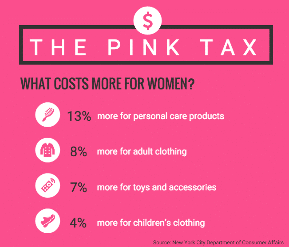 It’s worth taking note of the role color has played in this pricing imbalance. Businesses are intentionally using the color pink to get more for these products. And because of our society’s psychological perception of the feminine color, it’s working.
“Some items marketed to women not only cost more but actually contain less of the product because manufacturers make the product smaller and more feminine-looking, an approach called “shrink it and pink it.”“
(The Pink Tax: Why Women’s Products Often Cost More, USNews.com)
While products geared towards women may not all be pink, the DCA noted clear differences in packaging design that gives the perception of gender to products:
“The products targeted to men are in dark-colored, boxy bottles that are explicitly marked “for men.” The products targeted to women, while they may not explicitly include the word “women” on the packaging, have marketing that seems geared to female consumers: they are packaged in light-colored, curvy bottles.“
(© December 2015. New York City Department of Consumer Affairs)
The price hike on women’s & girl’s products starts early. Even children’s toys cost more if they’re pink.
“Boomerang Commerce did a study of 50 popular kids products at six online retailers including Target, Amazon, Walmart, Macy’s, JCPenney and Bloomingdales. They analyzed items in a variety of colors and every time, the pink-colored item was the most expensive. Pink items compared to other colors ranged from 2-15% more.“
(The Pink Tax – The Cost of Being a Female Consumer)
EFFECTIVE, BUT UNETHICAL

A Dollar Shave Club advertisement visually saying that men & women deserve equal products at equal prices.
The Pink Tax is definitely an unethical use of color. But companies are only able to achieve this industry-standard price gouge because of the influence it has. Enough people are willing to pay more to conform to the idea that to be feminine, girls must be in pink.
Our society is changing this by obliterating gender roles, blurring the lines of gender-specific fashion, & ignoring traditional color assignments. Companies such as Dollar Shave Club have made this part of their mission. Their marketing uses all-inclusive color palettes to support their unisex, “same quality for all” messaging.
Fight the Pink Tax by calling it out when you see it. Post a photo of the offending product on social media with the hashtag #GenderPricing. (And of course, just opt for the gender-neutral, or less expensive version, whenever possible.)
GREENWASHING
Another social issue that color has influenced is the so-called “Green Movement.” The mass push to reduce the harmful impact we as humans have on the environment. The uprise has sparked a huge increase in products & companies that boast they are eco-friendly, sustainable, & have a shrinking carbon footprint. But how many actually live up to their claims, & how many are utilizing the influence of color to make people think they are?

THE POWER OF GREEN
So what’s the difference between actually “going green” & giving things a “green sheen?” The leading institution on the subject defines it, & also gives us the “7 Sins of Greenwashing” as a guide.
“Greenwashing is defined as the act of misleading consumers about the environmental practices of a company or the environmental benefits of a product or service.”
(The Sins of Greenwashing, 2010 Edition, TerraChoice)
The term was coined in the 1980’s, when oil giant Chevron released a series of feel-good commercials aimed at improving the public’s opinion of their environmental impact. However, while they were cleaning up their PR, their business practices were still cruddy.
“In the mid-1980s, oil company Chevron commissioned a series of expensive television and print ads to broadcast its environmental dedication. But while the infamous The People Do campaign ran, Chevron was violating the Clean Air Act, Clean Water Act and spilling oil into wildlife refuges.”
(What is Greenwashing? – BusinessNewsDaily.com)
Today, the concept has been applied to just about every industry. Products labeled as all-natural have flooded shelves & are easy to spot. Packaging designed in greens, featuring images of water, flowers, or nature scenes, with messaging containing meaningless, vague terms like “pure,” or adding prefaces like “bio” & “eco” to their names – greenwashed products are everywhere.
IT’S NOT EASY BEING GREEN
One of the most common & easy ways to make something appear greener? Literally make it green. Marketers picked up on this quickly, as “products labeled “green” increased by 73% from 2009 to 2010” (Eluxe Magazine).
However, in their 2010 “Sins of Greenwashing” study, TerraChoice reported that out of the 5,296 products surveyed in the U.S. and Canada that made an environmental claim, only 4.5% of them were sin-free.

These hemp products look natural, eco-friendly, & sustainable. In reality, they’re full of synthetic ingredients, chemicals, & in packaging that gives no consideration to the environment.
NOT QUITE THERE
We care now more than ever about where the things we buy come from, how much waste it made, & how sustainable it is once it’s served its purpose. Most companies see this & want to capitalize on it. But making the changes in production & sourcing to meet these new expectations is expensive.
Some companies are making huge strides in the right direction & have every right to put a happy, green earth on all their products. But too many make a few small changes while ignoring larger, systematic problems, & only pointing out their “green efforts” to the public.
Products & brands often rely on colors & elements that make people think “natural, fresh, & good for the environment.” By designing packaging with various shades of green, paired with leaves & other natural-looking elements, products emit the “feeling” that they are an eco-friendly choice – even when the opposite is true.
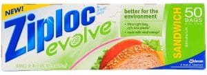
No amount of greenwashing can change the fact that single-use plastics like these sandwich bags are bad for the environment.
For example, Ziploc Brand’s ‘evolve’ plastic bags tout using 25% less plastic. That’s good in comparison to their standard bags, but overall single-use plastics are not an eco-friendly product. The company is still promoting the harmful use of disposable plastics, but using greenwashing to put their consumers at ease, because it’s “better” than it was. This is an example of the “Lesser of Two Evils” Sin of Greenwashing.
INFLUENCE WISELY
It’s undeniable that color plays a role in how we perceive things. The effects can be both positive & negative. As socially responsible marketers, designers, business owners, developers, & members of a community, carefully consider the meanings & messages behind the colors you choose for your marketing.
Here are a few things to always keep in mind:
- When using colors to attract a specific audience, be mindful of cultural considerations
- Avoid using colors that are misleading, deceptive, or rely on stereotyping
- Make sure the colors you do choose are thoughtful, noticeable, & impactful!

