20 Feb Choosing Colors for Signs

A few things to think about while choosing colors for signs.
Signage is still a necessary marketing tool for your business. Good signage announces your presence, captures attention, conveys quick messages, and contributes to your overall brand recognition. Adding or updating a sign or graphic on your storefront can reinvigorate its ability to get noticed. When choosing colors for signs there are some important factors to consider to make them successful.
COLOR CONTRAST
One of the most critical factors when choosing colors for signs is color contrast. The higher the contrast, the more visible and eye-catching your colors will be together. High contrasting colors are especially important for text, logos, and directional symbols on signs so they can be read from a distance.

Different color combinations have varying levels of contrast. The best combinations include a color of darker value, and one of lighter value. Value refers to the relative lightness or darkness of a color. It is the difference in value that creates contrast.

Opposite color pairs (diagonal on the color wheel) typically have high contrast if their values are different. Purple and yellow are a good example of this. Purple is naturally a dark value, and yellow is a light value, so these opposite colors have high contrast and high visibility. Harmonious colors similar in value, like green and blue, have low contrast and low visibility.

Opposite colors with similar values can create a visual vibration effect. These colors are difficult to read and uncomfortable to look at. Red and green together are an example of a vibrating color combination to stay away from.

It is possible to choose colors that are close together on the color wheel (harmonious colors) and create greater contrast with different values. Experiment with the values of colors to see what gives you the most contrast. As a result, you can create a harmonious color pair with high contrast.
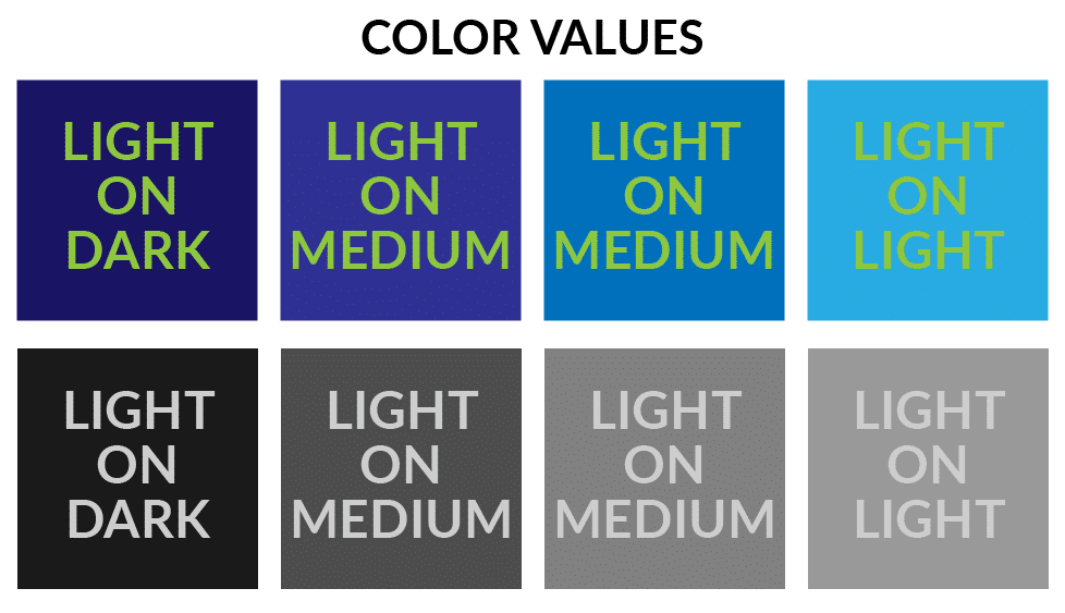
For example, take a look at these samples – the green text is the same color on all squares, but the value of the blue background changes from dark to light. Because of this, the text becomes less readable the lighter the background gets.

TONE OF VOICE
Another factor to consider when choosing colors for signs is what tone of voice you are trying to convey. Color impacts our moods and can represent different emotions and states of mind. It is a valuable element of marketing and worth taking time to consider.
For example, a bright red sign with black letters appears urgent, assertive, and authoritative. Whereas a sign with a light lavender background and royal blue lettering might feel relaxed, welcoming, and ornate.

Both of these color pair options have high contrast. But the moods they convey are very different. When choosing colors for signs consider what the intended message is, and what kind of tone of voice goes with it.
Colors that are typically associated with urgency and high-energy include reds, oranges, yellows, and pinks. These warmer colors are eye-catching and reminiscent of summer heat, bright lights, and action.
On the cooler spectrum, green, blue, and purple hues are often used to create a sense of calm, luxury, and trustworthiness.


For more on How Color Effects Us check out this blog post.
SIGN ENVIRONMENT
The last factor to think about while planning signage is where it will be located. The environment can have a big impact on how your sign will look in its final application.
Will your sign be placed indoors or outdoors? Will it be in a shaded area or a brightly lit one? Is it important that your sign be legible at all hours of the day or only during certain times? Will it have its own lighting source? Will it be placed against a white wall or a dark one? Or will it be placed on a fence surrounded by green grass?

Knowing the surroundings can inform many of your decisions when choosing colors for signs. Imagine your sign will be placed on the shaded side of a building. By knowing this in advance, you can choose a white background with dark lettering to maximize legibility, even in dimly lit areas.
As another example, think about a sign on the outside of a red-brick building. A complimentary color, like a blue background, can capture more attention by being naturally visually appealing.

COLOR CAUTION
On the other hand, if you don’t consider where your sign will be placed, you may unintentionally pick colors that work against your goals. Your sign may be in conflict with a neighboring one, making them both look unappealing. Or you could end up with a background color too close to the color of the environment, and lose valuable impact.
To avoid any issues, be sure to scope out the placement of your sign. Make a note of the surroundings or even take a few photos to reference while you’re choosing colors for signs.
With planning and consideration for contrast, tone, and environment, you’ll create impactful signage that captures attention and enhances your brand awareness!


