28 Feb Designing for Different Groups
DESIGNING FOR DIFFERENT GROUPS
Everyone sees and interprets the world through their own unique lens. That’s why being intentional when designing for different groups is so important. Graphic Design is visual communication. Your message needs to speak to your intended audience on a personal level.
So how can you decide which design styles & trends to use in your marketing?
Take a glance at these helpful tips from our Graphic Design team.
You’ll gain a better understanding of how intentionally designing for different groups impacts your marketing. Then, we’ll examine ad campaigns that were designed to target specific groups.
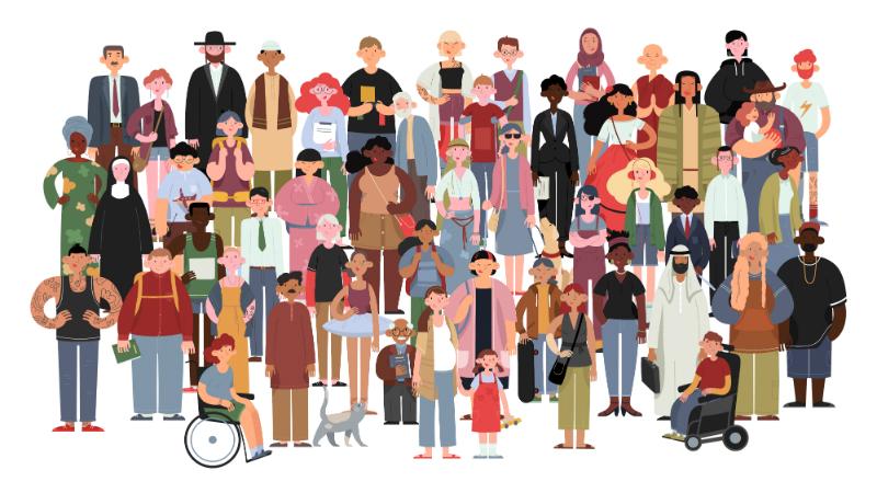
PEOPLE ARE DIVERSE
This may seem obvious, but there are a lot of different people out there. There are infinite factors that impact us & how we communicate. From the decade we were born, our family’s influence, the part of the world we grew up in, the cultural norms around us – the variables are endless.
Our goal as visual communicators is to hone in on the traits & commonalities that unite us into larger populations. And then we use those unifying factors to relate, connect, & ultimately guide to action.
Ideally your messages & visual elements appeal to a larger, widely inclusive group of people. Things like language, graphics, illustrations, layouts, colors, & typography.
Tip #1 – When designing for different groups, know the specific traits of the population you’re designing for.
Get to know the relatable traits of the people you want to reach. Let’s learn some vocabulary words real quick.
Demographics are defined as “statistical data relating to the population and particular groups within it.”
Psychographics is defined as “the study and classification of people according to their attitudes, aspirations, and other psychological criteria.”
Some examples of demographics marketers commonly use are age range, income level, education, gender, family status, & professional industry. On the less tangible side of things, examples of psychographics include things like personal interests, recreational activities, hobbies, values & beliefs.
Who are you designing for?
Before you begin to create a design or craft a message, consider who it’s for. Who do you want to notice it? What defining traits do they possess? How do you think they’ll interpret your word choice & visuals? Consider the factors that impact how they communicate.
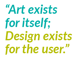
One of the biggest differences between creating art & designing is the intent. Art exists for itself; Design exists for the user.
When designing for different groups, it’s important to make design choices based on what will be most impactful. Your goal is to create something that resonates with your desired audience. Keep in mind, that might be different than your own personal preferences.
Which brings us to our next helpful tip…
Tip #2 – Do your marketing research.
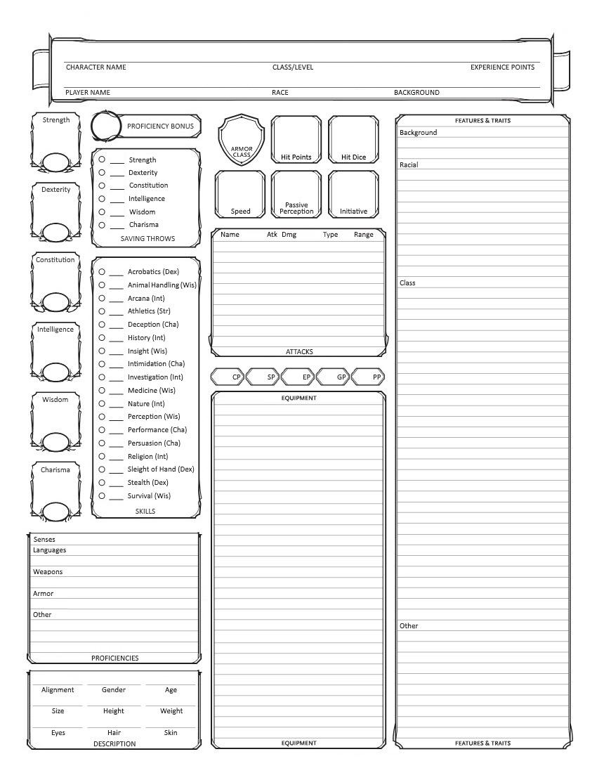
A character sheet is very similar to a customer persona.
As part of research & planning, many marketers create “personas” for each population they target. These “character sheets” (for you D&D players) are generalizations of the groups a brand considers part of their target audience.
Having this information ready is helpful when designing for different demographics. It allows you to quickly get into the headspace of the people you’re designing for. In addition, it helps you craft messages that will be more relevant to them.
It’s important to know who you’re communicating to on every project. Whether you create personas or not, make sure you have a solid understanding of who you’re creating for.
Once you know the “who,” you can start thinking about the “how.”
DEFINE YOUR STYLE
You’ve defined who you’re talking to. Now, find out what appeals to them. Learn the design trends they gravitate towards.
For instance, do they like bright designs with lots of color that make them feel energized? Or does your group prefer subdued, neutral tones that help them feel in control? Are they modern – drawn to clean lines & white space? Or maybe they’re attracted to heavily detailed designs, with plenty to entertain a distracted mind…
Tip #3 – Develop a style for each of your target segments to help tailor your marketing pieces.
Groups are unified by common traits. Within those groups, subcultures develop with their own unique aesthetics. Social media is a great tool for researching what different groups like. People interact on social media based on many of the same things marketers look for. Personal interests, hobbies, activities, shopping preferences; everything a company could ever want to know about its patrons is online.
In addition, people love to belong to groups. The sense of connection & belonging they give us is empowering. Smart marketers keep this in mind, & use it in their messaging. Check out this ad campaign series by Facebook Groups, doing just that.
Photo slideshow


Consider your own social media activity. How many groups do you belong to, interact with, or are aware of that friends belong to? Groups about funny animal memes, beautiful nature photography, or sharing phenomenal cuisine?
Think of how designers & marketer use what they learn about you on social media. They use your favorite color schemes, design layouts that feel like your favorite content, & even niche lingo or slang.
Use your company or organization’s social media presence to interact online with members of your community. You can learn a lot about the people who are most responsive, & ultimately take action. Utilize engaging posts, encourage comments & feedback, test visuals & messages, & post in different groups.
KNOW THE BASICS

Retro 80’s elements gives this flat vector design a nostalgic feel.
Graphic Design trends, much like fashion trends, go in & out of style. Some become traditional & stay around as timeless classics. (The LBD has been a closet staple since the 1920’s, for instance.) Trends are revisited, recycled, & reworked into something fresh & new. Innovation is always welcome, & nostalgia often is, too.
Knowing basic design principles is key to knowing how to use them to cater to an audience. A design is the sum of all its elements. Look at each element & think about how it will have an impact on your overall message.
Tip #4 – Consider all the aspects of design that you can use to draw in your desired group.
Here are a few of the core aspects of design to be tailored when designing for different groups:
- Color palettes
- Fonts & typography
- Visuals; graphics and/or photos
- Composition & Layout (flow, white space, silhouettes)
Let’s take a look at successful advertisements designed with specific groups in mind. For our purposes, we’re looking at these groups within the United States.
First, let’s look at advertisements designed to target the ever-popular age group known as “Millennials.” With some quick market research, we can figure out a lot about this very large age population.

What do we know about this age group?
There are a lot of myths surrounding Millennials. Many of them are inaccurate, as proven by statistics. Even still, they persist as stereotypes. (More on why you want to avoid that later.) Some of the most common ones are that Millennials are lazy, narcissistic, & entitled. But the numbers give us a very different picture.
MILLENNIAL MARKET RESEARCH
Millennials are considered to be roughly defined as the group of people born between 1980 – 2000. As of 2015, they became the largest generation in the American workforce, according to the Pew Research Center.
They are more diverse than previous generations, with a non-Hispanic White population of 55%, compared to 84% when the Silent Generation were young adults. More Millennial women participate in the workforce than any generation before, with 72% employed. (Pew Research Center.)
Their upbringing marked by the Great Recession, & entering a particularly challenging job market, Millennials are expected to have a lower standard of living than their parents. They share an inherent distrust of traditional media & corporations. Authenticity & transparency are highly valued in this group.
Their impact on how technology is evolving is a big one…
 Millennials are the first generation to be considered “digital natives,” having grown up with today’s technology. Smart phones became a personal staple in their teen years (& 90% of them now have one). Social media was made for them, & flourished with them into adulthood.
They embrace progress & the future of technology. However, they are also a highly sentimental bunch. As such, they are very responsive to “nostalgia-marketing.” They value experiences over material possessions, with 78% reporting they’d rather spend money on a desirable experience over buying something.
Millennials want to make a difference…
One of the biggest psychographic markers of this group is their desire to positively impact social change. In a 2014 report by the Society for Human Resource Management, they found “94 percent (of Millennials) like using their skills to benefit a cause.”
These young adults also want to give back. Not just with dollars, but with their time & energy. An estimated 64% volunteer locally. In addition, 55% say they attend fundraising events. According to a 2018 report, “84% of Millennials give to charity, donating an annual average of $481 across 3.3 organizations.”
What can we learn from all this?
Insights gained from researching a target group are valuable. Figuring out how to best utilize those insights in your marketing is the next step. What do we know about our target group from the above market research?
THE BREAKDOWN:
- Millennials are currently 20 to 40 years old, & are most are employed; Younger adults, with purchasing power.
- They want honesty from companies & the media, & want to do good with their work (not just make money)
- Focus on their experiences with your brand, not a single purchase or transaction
- As digital natives, this group is in-step with modern visuals; think Instagram, Pinterest, & web-inspired formats
- Create a sense of sentimental value to increase connection – good opportunity to use slang, or pop culture references
For example, take a look at this series of advertisements for the popular music streaming service, Spotify. Once you know the stats, the design choices made to favor Millennials become apparent.
“As of March 2018, Spotify’s user base was dominated by Millennials, with 29 percent of its users aged 25 to 34 and 26 percent aged between 18 and 24 years old.” (Statista, November 2019)
Photo slideshow


CASE STUDY: SPOTIFY
These ads mimic a popular social media meme. They are relatable to social media users on their level. There is minimal text to read, & relies on a visual to complete the message. They’re optimal for viewing on a smart phone, which is the most likely way Millennial users will see them.
An example of the popular “Me, Also Me” format of meme, which Spotify has adapted for their campaign targeting younger demographics.
The colors chosen are rich & highly contrasting. In general, younger audiences prefer brighter, more intense color palettes. The color pink has increased in popularity over the last two decades, especially with younger groups. In addition, older generations consider pink to be a feminine color. But newer generations embrace breaking traditional gender roles. There’s even a gender-neutral hue that has been coined “Millennial Pink.”
Nostalgia Marketing…
In Spotify’s advertisement comparing the year 1998 to 2019, they are drawing on user’s nostalgia. The light pink & blue color scheme, as well as referencing popular culture & styles from the 90’s is a draw for now-adults who were kids & teens during the time. Even the tagline at the bottom, “Listen like you used to,” is a call to remember “the good old days.”
Overall, these ads successfully target Millennials. Of course, there are many other facets to look at beyond generation. Consider what area of the country your audience lives & what they identify with. Think pop music vs. bluegrass; steak & potatoes vs. vegan Thai food; mainstream media vs. grassroots publications.
But, be cautious when considering these types of preferences. Which leads us to our next tip for designing for different groups…
Tip #5 – Be careful not to stereotype.
 As you determine a direction when designing for different groups base your decisions on real, accurate information. It’s easy for misconceptions, or stereotypes, to slip into your marketing concepts if you’re not mindful. At best, your designs won’t have a meaningful impact on anyone. At worst, stereotyping can alienate your audience & leave them with a negative impression of your brand.
There are many common stereotypes that often make their way into marketing. These include misbeliefs based on gender, ageism, & cultural practices. In the past, some of these commonly held beliefs were used to inform marketing. But today, we have the tools & ability to learn more about people than ever before. And it’s shown us that many (if not most) of these stereotypes are just plain incorrect.
“Audience stereotypes have been used to help focus the creative and buying strategy – for example assumptions such as “men watch sports, like beer and play video games,” have been around for decades. However, with more data available than ever before, it’s time to reexamine traditional marketing stereotypes.” (“Stereotypes in Advertising: A help or a hindrance”, Comscore)
FOCUS ON THE FACTS
Besides being inaccurate, therefore not resonating with real people, stereotypes can be extremely harmful. Gender stereotyping, for instance, has been proven to have a significant negative impact on individual mental health. In fact, the Advertising Standards Authority (ASA) in the UK has enacted a ban on harmful gender stereotypes in advertising.
WHAT NOT TO DO…
Let’s take a look at an example of harmful stereotypes in advertising. This ad for Mondelez’s Philadelphia was banned in the UK in June of 2019 for gender stereotyping. At the start of the ad, we see a woman hand a baby to a man before she departs. The man is joined by another man, also with a child in his care. The two (presumably) fathers get distracted by food, & place their babies onto the restaurant’s conveyor belt. In a cartoon-esque panic, the men realize their blunder & rescue their children in time. All is well. Right? Not quite…
Photo slideshow


The ad was clearly meant to be funny. But the humor relies on the viewer sharing the notion that men are less adequate caregivers than women. It relies on an inaccurate stereotype of men as “bumbling idiots.” This is why it’s harmful – it sends the message that men aren’t as good at parenting as women are. It perpetuates a negative portrayal of men in general.
In-tune marketers focus on the facts they learn to inform their creative messaging & visuals.
Write down what you learn about your target audience. Leave off anything you think you know, & any traits you don’t have concrete evidence of to back up. Is it a stereotype, or a generalization based on nothing but popular opinion? Then it shouldn’t be instilled in your marketing.
KEEP EVOLVING
People change with the times. As individuals & as a population. The “it” trends come back around from time to time, but each generation adds their flare.
For example, take a quick look at one design factor that easily demonstrates how trends change over time – Color. Check out this collection of color palettes by decade. They represent 100 years of colors that defined US popular culture. Plus, read some fascinating info on what influenced these trends. Like how we went from moody jewel tones in the 90’s, to neon brights in the 2000’s.
Photo slideshow


Tip #6 – Stay in-tune with your target market groups, & evolve your designs accordingly.
Market research is an ongoing activity. Good marketers are never “done” getting to know their audience better, because that audience is ever-changing. Keep your research up to date to always have fresh ideas based on the latest, most relevant info.
Although your brand may stay relatively the same (ie: your logo, main brand colors, & unifying elements) your marketing designs have a shorter lifespan. Therefore your design styles can morph over time, but stay cohesive with your overall branding. Above all, your marketing stays relevant & fresh.
NIKE STYLES OVER TIME
The company Nike has been around for awhile, which lets us see the progression of their marketing designs. Below are three of their advertisements. One is from 1980; the other two are from 2019.
These pieces were designed for the same target group; young, athletic women. But the design choices made, from the photos used to the fonts & colors, are very different.
Photo slideshow


Looking at the piece from 1980, the muted & neutral color palette stands out immediately. The composition of the image puts the shoes at the center. As such, the viewer’s focus is on the product itself, rather than the experience the person is having. Other than jumping (or flying?) we can’t tell what the person is doing.
The bold headline speaks socially to the resurgence of The Women’s Liberation Movement in the 80’s. The text at the bottom is focused on pointing out that this product is designed especially for women. (Variations of the word “woman” are printed 6 times.)
JUMPING FORWARD
In contrast, the ads from 2019 are on dramatic black backgrounds. The colors in the composition were chosen to help the products stand out. However, the products are not the focus of the images.
In the first ad, the color of the shoes matches the tennis ball & the racket. This draws the eye to those elements specifically, which helps tell the “story” of the picture. The shoes are one piece of the puzzle making up the experience we’re witnessing. This marketing is “selling” us the idea of this athlete pursuing their dreams, & showing us how their product fits in.
Similarly, in the second ad, the green color of the featured sports top & the racket create a simple but energized color palette. Again, the overall message focuses on the moment happening as a whole.
![]() Both of the 2019 ads are targeting women. Their marketers achieve this through design aesthetics, rather than relying on text.
Both of the 2019 ads are targeting women. Their marketers achieve this through design aesthetics, rather than relying on text.
Tip #7 – Keep your core branding consistent.
Their design styles change (a lot) depending on what market they are designing for. But Nike’s “swoosh” logo & core branding has stayed largely the same since 1978. This consistency gives them instant brand recognition around the world.
Apply the same concept to your own marketing. Once you’ve designed your company’s branding, keep it consistent. Instead, use your marketing pieces to explore different visual approaches, & test what works best for your target audiences.
Tip #8 – Know when to work with a professional.
If you’re in a position wearing multiple hats, then there’s a good chance one of them is “designer.” (Since you’ve made it to the bottom of this blog post, we’ll assume it’s probably in there!)
Design is a complex art form. Sometimes it requires drawing on years of experience & insights to be maximally effective. Like any industry, there are notable differences in the work of a novice, compared to a master.
Knowing when your skills can handle it, & when to call on the experts is a skill in itself! Factors like timeframe, artistic ability, & the desired impact of your piece are things to consider.
Thanks for reading!
We hope these tips on designing for different groups help you create more engaging, relevant, & successful materials. Stay tuned to our blog for more useful info like this!
Give us a call for personalized help.
Need a professional designer to brainstorm with? Or want to hire one. Our team is standing by!

