06 Aug Designing With Neon
NEON IS BACK
Like in clothing fashion, trends in graphic design often make a revamped appearance when the time is right. With better technology, and the intensity of our lifestyles and society these days, it’s almost expected that styles are getting bolder, brighter, and more edgy.
Right now the bold styles of the 80’s are making a comeback, and with AnchorPointe’s new Neon Printing capability we’re ready to help our customers make some bodacious new materials.
But there can be too much of a good thing, especially when it comes to colors that can become eye-smarting all too easily. To avoid creating vibrating color combinations that can create painful-to-look-at layouts, here are a few tips for designing with neon in print for today’s world.
KEEP IT SIMPLE
The last few decades have led us to clean, contemporary, and simple design, with a heavy emphasis on typography. Keep these trends in mind when designing with neon to avoid layouts that are too busy or too loud.
Be picky about which elements in your design are neon, and keep readability as your number one focus.
LESS IS MORE
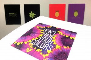
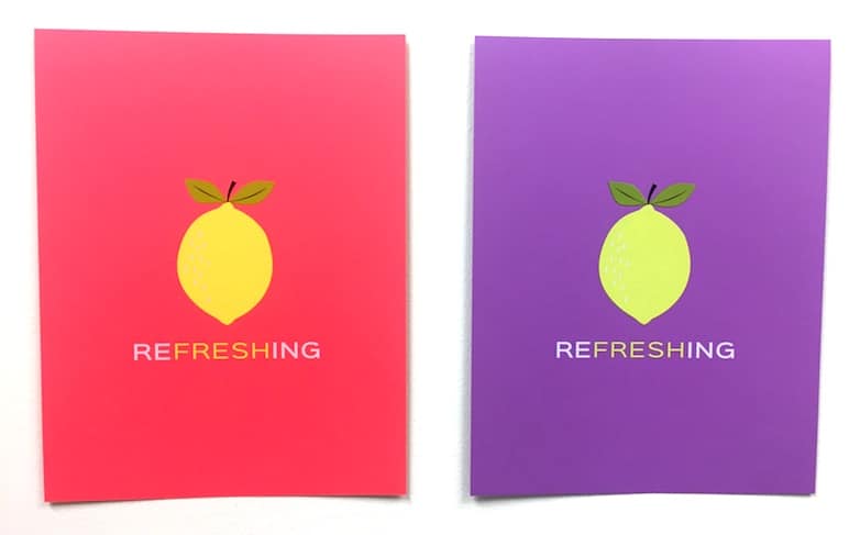
The trademark trait of neon is that it immediately draws attention to itself. But if there is too much neon in one place, or too much other visual noise, it can be distracting. The message of your design is always paramount – make sure it doesn’t get lost.
Choose harmonious neons to work with, or add to a standard color palette. Limit the number of neon colors used in one design, and make sure they work well together.
ENHANCE IT
When designing with neon, help it make the most impact in your layout. Contrast neon with dark backgrounds, or use neon as your background and keep the elements on top darker and simple.
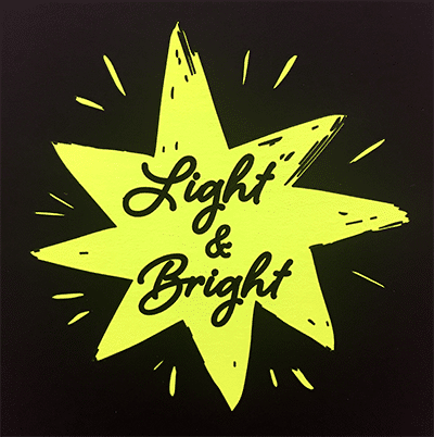
Keep a balanced amount of white space in your layout to keep the eye flowing from the focal point (neon) to the rest of your message.
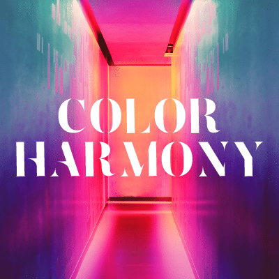
TRANSITIONS ARE GOOD
In addition to solid neon, the use of gradients and rainbow-like washes of color are making a big appearance. In combination with minimalist trends, these striking color transitions are at the forefront of modern design.
Often seen as a wash over photography, and in conjunction with the trends of double exposure, and double-duotone, gradients are versatile and aesthetically pleasing to everyone.
![]()
NEON ON
With exciting new technologies in both print and web based media, the spectrum of color available for designers is wider and more encompassing. We’re capable of producing brighter, richer, more striking designs than ever before – no wonder we’re craving neon!
Keep your eyes open to spot neon colors in clothing design, product design, and graphic design – neons are new again, and we couldn’t be more thrilled about this totally awesome trend!

