07 Jun Designing for Print

Designing for Print (3 Tips from the Experts)
Design better looking materials that cost less and save time with these insider tips.
Did you know that the way your materials are designed can affect how much they cost, and how long they take to make? By designing for print while considering how the materials will be made, you can make projects easier to produce, saving time and resources.
We’ve written down these 3 tips to share from our in-house design team. Whether you’re a “DIY” designer, a professional, or are approving projects for print, here’s what you need to know about designing for print!

Symmetrical borders or margins are more difficult to print.
Paper going through a printer is in constant motion, which can cause placements to shift slightly (up to 1/16”). Symmetrical designs – such as borders and margins – make this shift much more noticeable to the human eye.Due to this, these jobs require more total copies to be produced in order to get enough that look “right” to fulfill the quantity. Copies that don’t meet the standard are recycled as “waste,” which can increase the cost overall.
Difficult to print designs = more materials needed = higher job cost


Plan around it:
- When designing for print, use asymmetrical elements, full backgrounds, organic shapes, and large images that bleed (go off the edge) to disguise variations.
- Avoid even margins, borders, centered blocks, and other symmetrical elements that make it easier to notice slight imperfections.
- If using a border or margin, make it at least ½” wide and bleed off the edges. Thicker borders and margins will appear less noticeably off-center than thinner ones.
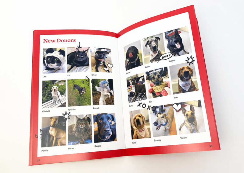
The red borders on this booklet for Dove Lewis are 1/2″ wide and bleed off the page, helping to minimize the appearance of any shifting that occurred during print and bindery.
Paper type makes a difference.
Various paper textures, finishes, weights, and coatings all affect how printed toners and inks will look. For example, if your design features a heavy flood of color but will be printed on a heavily textured stock, it could end up looking blotchy and uneven. Whereas on a smooth, coated stock a flood of color will look rich, even toned, and vibrant. Knowing how ink looks on different paper types will help you make better decisions while designing for print. Colors will appear differently printed on coated or uncoated paper. Coated paper helps colors look bright and opaque. While uncoated paper will make colors appear subdued, faded, or even a few shades darker.

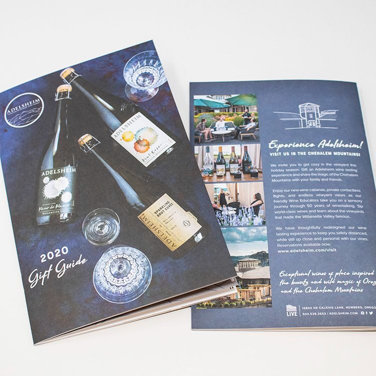
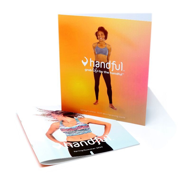
The book on the left (Adelsheim, 2020) is printed in full color on uncoated paper to give it an elegant, subdued look. In contrast, the bright oranges and full-color photos on the Handful materials stand out vibrantly on glossy coated paper.
Plan around it:
- Know ahead of time what kind of paper you are designing for. In general, coated stocks are better for full-coverage color and photos, while uncoated or textured stocks are best for a matte look with less coverage.
- Know how the colors you’ve selected for your design (or your brand’s colors) will appear on both coated and uncoated stocks to help you make better design decisions based on how the final outcome will look.
Pieces that fold or require bindery may need extra set-up.
When creating a booklet (annual reports, catalogs, manuals, etc.) or pieces with folds (trifolds, gatefolds, etc.), extra steps are needed to make sure content looks visually correct on the finished piece. In addition to creating eye-catching artwork, part of designing for print is about planning for how the physical piece will be put together.

For trifold brochures and other pieces with multiple panels, the innermost panels need to be slightly shorter than the others to allow them to nest inside and lay flat when closed. With pieces that gatefold, it’s important to make sure any images or text that will be placed across the edges of the front panels align correctly after trimming. This can mean overlapping the two sides slightly in the bleed area, so that they are aligned when trimmed.
ONLINE RESOURCE: This Folding Guide is a great tool for those designing for print. It can calculate the exact size each of your panels needs to be on folding materials based on the number of panels, style of fold, and size of paper being used.
For center spreads, placing a large photo or text crossing from one page to the other can make a nice visual impact. In order for these ‘crossover elements’ to work, the print file must account for the ‘gutter’ space. This is the approximately ¼” of the page that disappears as it curves into the spine.


This center spread features the word “CURIOSITY” in all capital letters. But since the gutter wasn’t accounted for during print set-up, the “O” is being swallowed by the spine of the magazine, distorting the word and making it difficult to read.
Plan around it:
- The best cross-over elements for a visual impact between panels or pages are big photos. Choose ones with wide swaths of color (like landscapes, or close-up images where the subject is big) and large text like headlines or single words.
- Avoid placing small text or images with fine details (especially faces!) across pages or where panels meet.
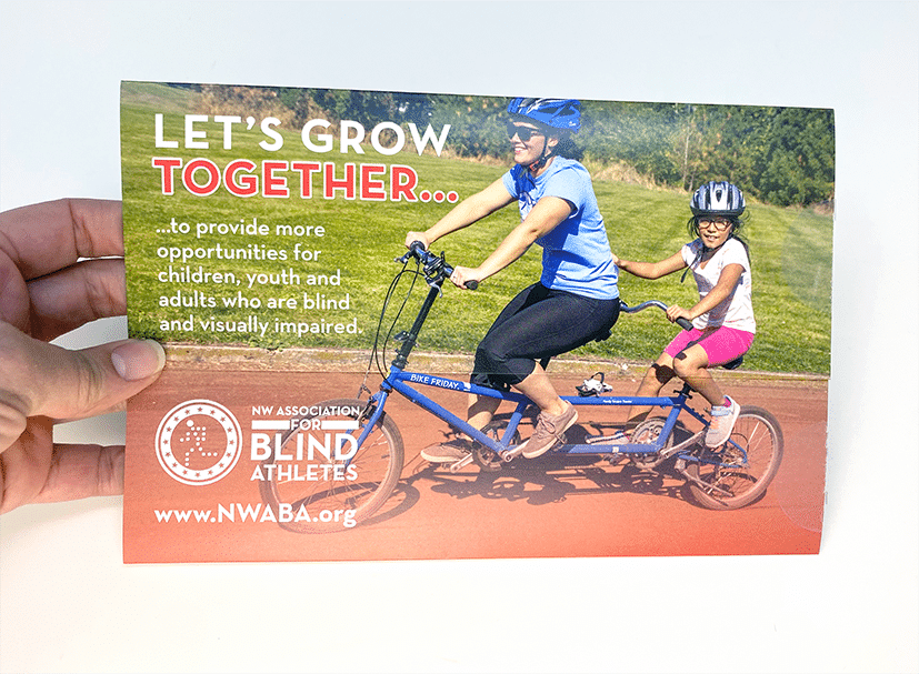
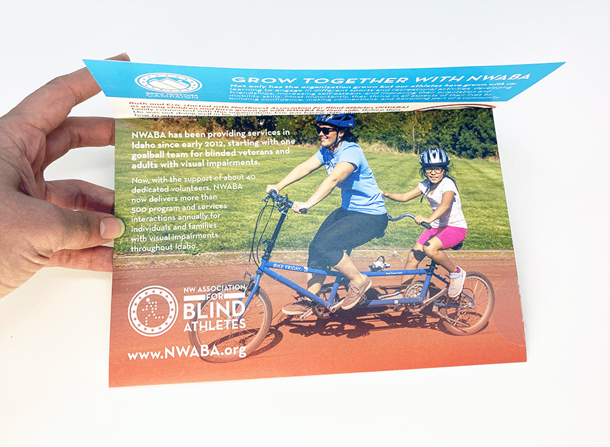
This self-mailer for NW Association of Blind Athletes (designed by AnchorPointe Graphics, 2023) features an uneven front fold, which creates a “peek-a-boo” effect when lifted to reveal the text underneath. The photo used for the background on both panels is aligned so that when the mailer is closed, the front panel looks flat.
Ensuring your designs are optimized for print can save you time and money on all your projects.
Follow these tips to create better looking materials that are faster and cost less to make! And if you’re looking for an even easier way to save time and money, start your projects with APG’s design department!


